Spur Connect
App Revision
Our team for this project was given the name Bucephalus, but could we tame this app as the great steed had been tamed by the once ruler of the world? This app revision was a great opportunity to work with a team, and uncover some of the most critical needs in our modern world. If we could conquer the challenge of business communication and tax reporting, perhaps we too could travel the far ends of the earth.
Objectives and materials
Materials
Google Sheets
Figma
Figjam
Pen, paper, and post it notes
Zoom
Objectives
Spur Connect is still in early development stages, but shows promise through holding a unique position in the marketplace
Our objectives with this app were to test the existing design, and suggest new features.
Phase 1
Cognitive walk through
We looked at the app through the eyes of a user, and discovered that a few things were out of place.
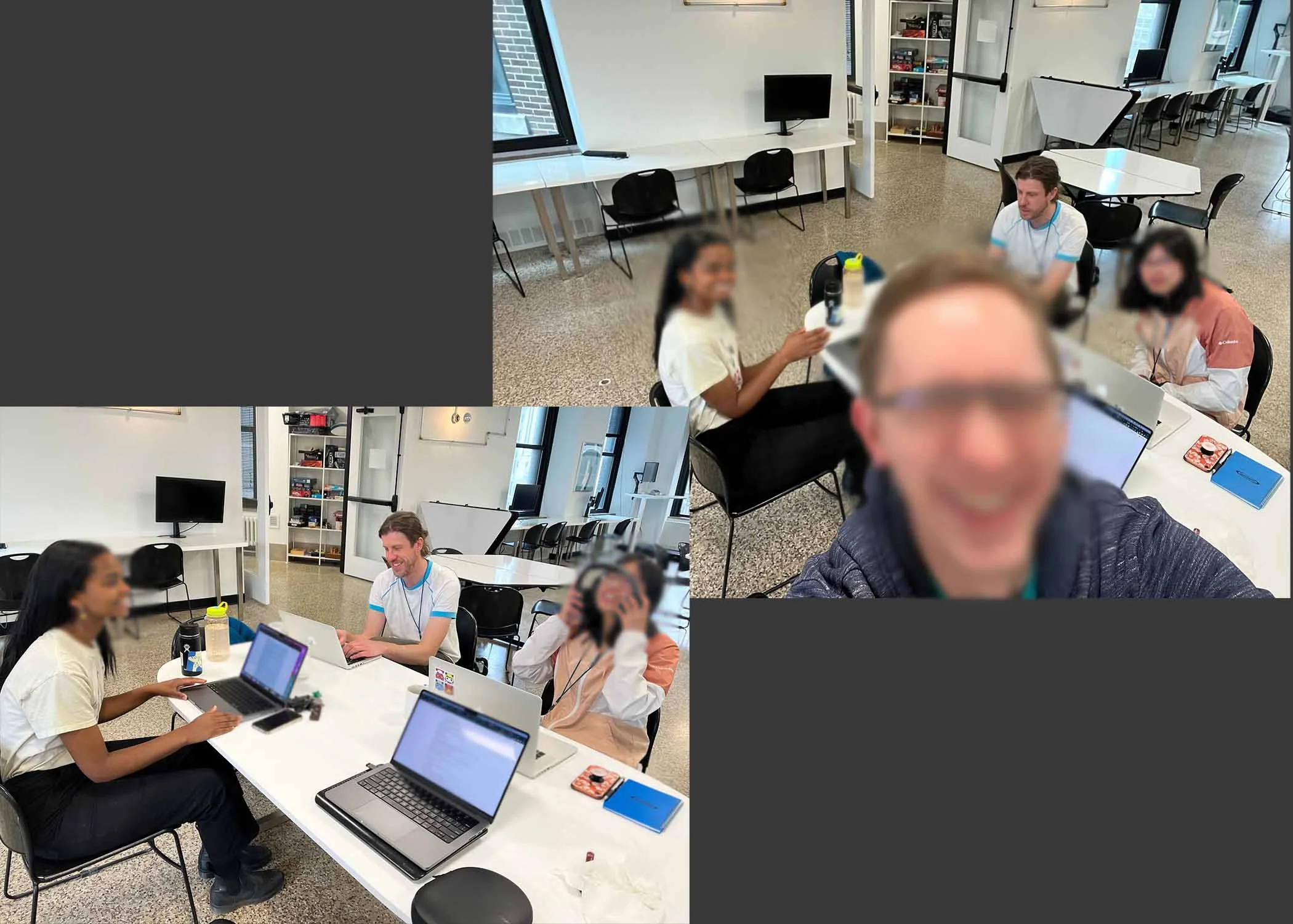
We had a four person team, and we divided the work evenly throughout. It was great working together. We found a quick rhythm, and worked out roles with ease.
This is probably where we learned the most about the Spur Connect app. Trying to use an unfinished app through the eyes of the user yielded useful information about the state of the app.
Phase 2
User Research
The next step in our journey was to do research, and talk to a business owner.
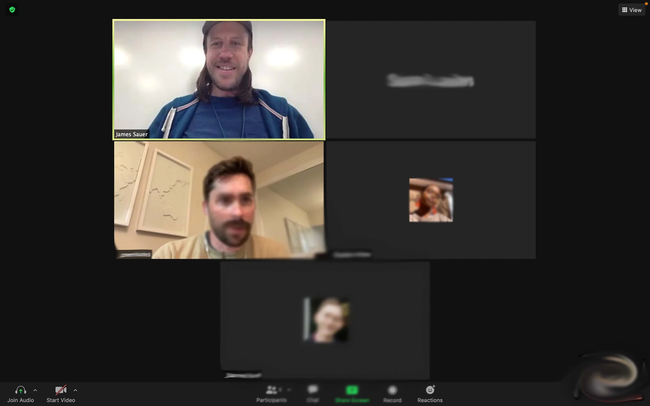
I was the main moderator for the session, and felt a good connection with the user.
Our user had great insights into what meetings are really like in his field. He had a very matter of fact approach to his communications, and gave us a perspective of what a real user might need.
Phase 3
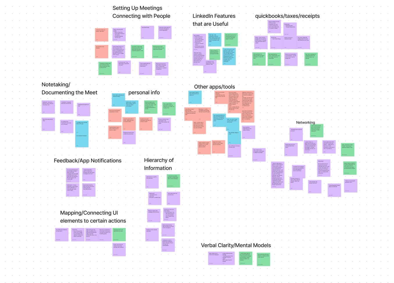
Interpreting the information
Our team came together again to crunch through all the information we had collected during our interview.
We had access to several other interviews that also helped to develop our understanding of potential users.
Information Architecture and Sketches
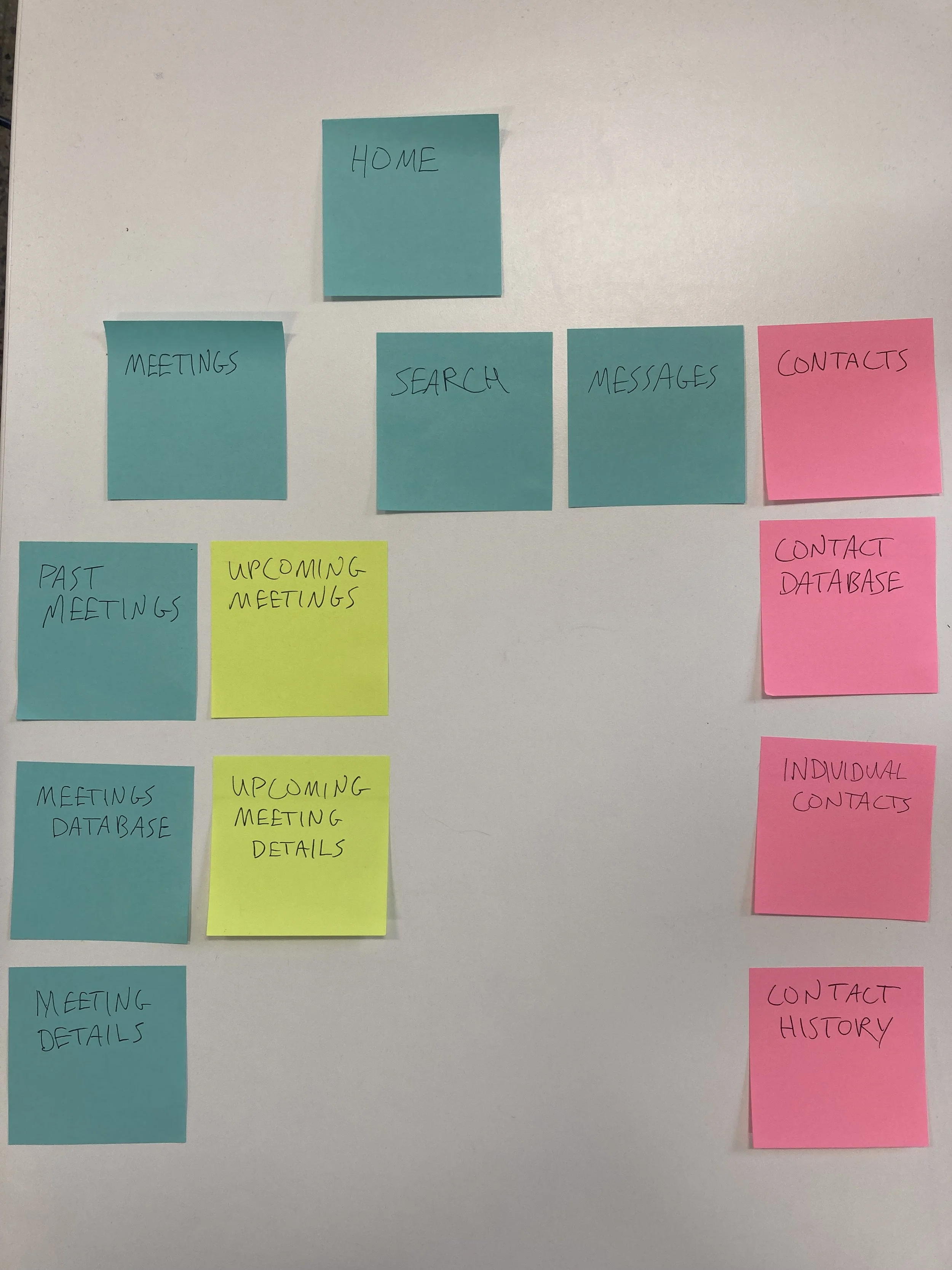
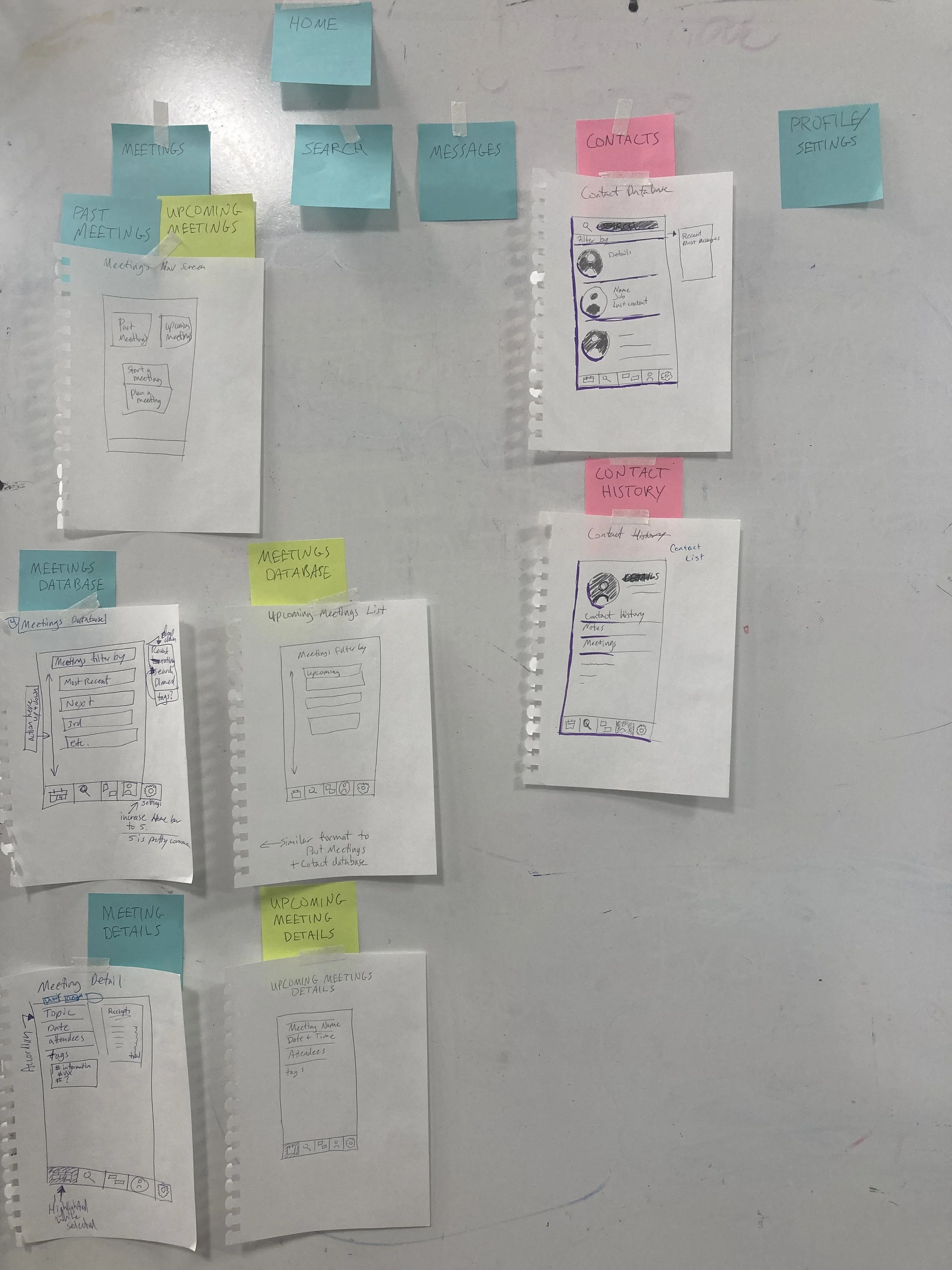
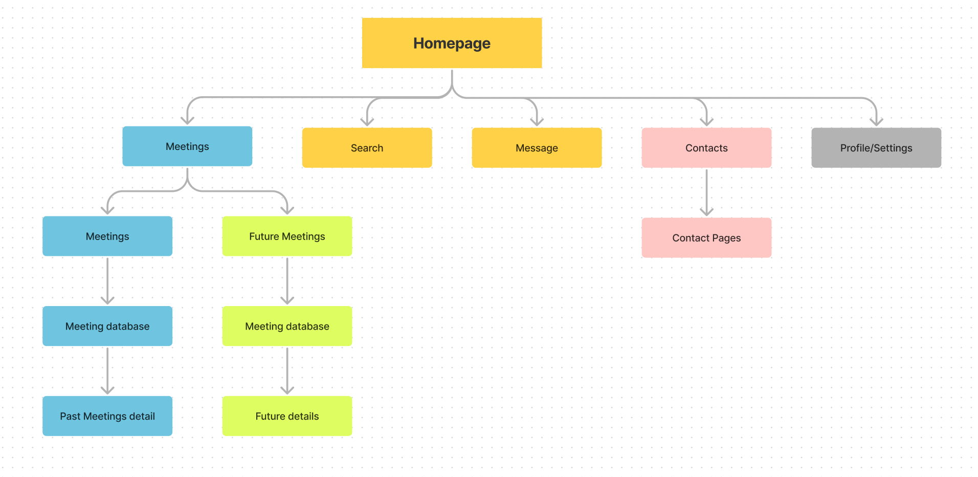
Below is the progression of information architecture diagrams: from post it notes on the table, to an expanded visualization with sketches, and a digitized version.
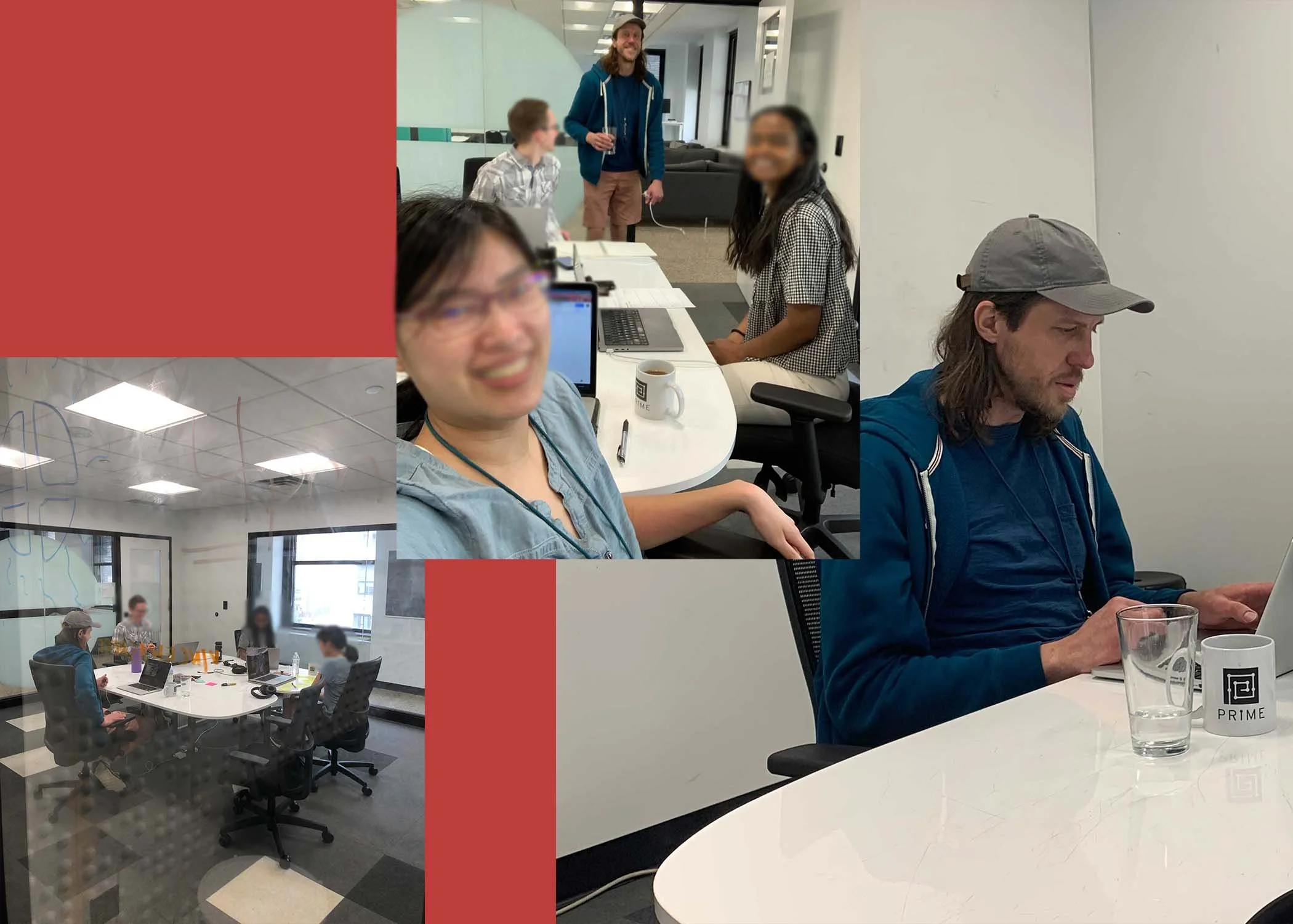
The high point of this design activity is getting everything up on the white board to see where it could all fit together.
Phase 4
Interactive tour
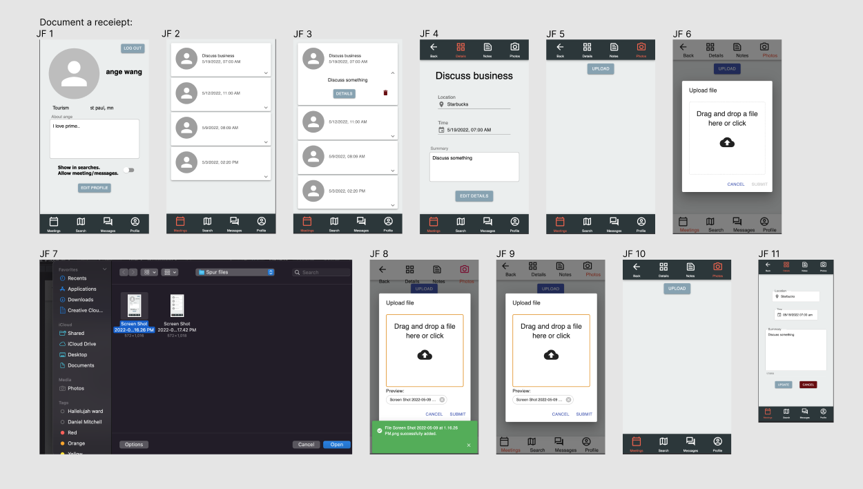
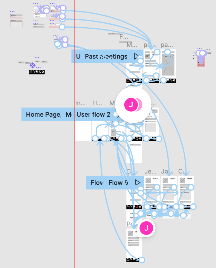
I created wireframe screen content in Figma where I showed potential changes and additions related to the user stories we created.
The section to the right with blue lines leading between screens is the guts of an interactive tour. It’s by no means a complete representation of app function, but does a good job visually connecting the ideas. It also adds a sense of functionality.
Below is a there is a video walkthrough of the examples.
Conclusion
Though we may not conquer the world anytime soon, Spur Connect has potential as an app for people who do business all over the country and potentially the world. It was a great experience to use user experiences to add elements to an app in development, and there is a lot to take away from this project. Gaining confidence both in moderating a user interview, and with analyzing what was learned, is a great feeling. It’s also one thing to have ideas to improve an app based on your own design aesthetic, but another to focus on the user. And, a stage further, to narrow the scope of your work to assist in development without taking over the project.
